Saul Bass


Saul Bass had an incredibly strong impact on graphic design in the middle of the 20th century. He helped introduce a new approach to working with design, in particular film titles and film posters. The likes of some major high-class names at the time, even commented on his work due to how powerful it was through its simplistic approach. The likes of Martin Scorsese a famous director who has reigned as an incredible director for years, found inspiration for some of his films, off of films like Vertigo and The Shining, in which both movie posters had been designed by Saul Bass. The fact that Bass was asked to design the posters for such famous films, helps show that he must have had a major impact on the design of movie posters at the time. Scorsese loved Bass’s work so much that he made the title sequence for Scorsese’s these films: Goodfellas (1990), The Age of Innocence (1993) and Casino (1995).
"Martin Scorsese aptly described the power of a Bass title sequence when he said, "His titles are not simply unimaginative ‘identification tags’ - as in many films - rather, they are integral to the film as a whole. When his work comes up on the screen, the movie itself truly begins.""- Pamela Haskins, Soul of Bass, Page 22.

Bass was born in New York City in 1920 to Jewish parents who were immigrants in America. Growing up in the 20’s and 30’s, Bass was surrounded by all of the popular graphic designers. He was already a majorly creative person as a child, so this art guided his upbringing in the direction of graphic design. Throughout the course of his life, through his work Bass ended up becoming one of the most major American Graphic Designers of the twentieth century. He was surrounded by artwork such as the artwork by Rubens which would have subconsciously influenced him at the time.

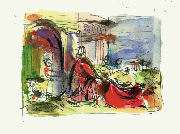
Bass created this design during one of his evening classes that he attended through his scholarship. The class was taught by a designer called Howard Trafton, who was well known for his extreme illustration skill.
“During the three-and-a-half years Saul studied with Trafton, he learned a great deal not only about modern art and design but also about the artists of the past.”– Jennifer Bass, Soul of Bass, Page 16
He was already a majorly creative person as a child, so this art guided his upbringing in the direction of graphic design. Throughout the course of his life, through his work Bass ended up becoming one of the most major American Graphic Designers of the twentieth century.
Following the end of his studies Bass chose to do freelancing for some time in order develop his own practise. He created logos, advertisements and art designs for different companies before finally working for Warner Bros in 1972. Following this success, he moved to Los Angeles to attract new clients and new audiences to his work. However, over time, he decided that he should open up his own company to develop his brand further, so he “established his private firm as Saul Bass & Associates.”

Howard Trafton had a heavy impact on Bass’s work, he was a strong guidance in leading Bass through the beginning stages of him learning illustration and design. Trafton typically seemed to us what was described as “freely brushed letters and crisp modern typography” (Jennifer Bass, Soul of Bass, Page 16). Some critics has said that this typography can be seen scattered throughout Bass’s later work, showing us how Trafton was the roots of Bass’s illustration style. He taught Bass that the soul to all illustration is the ability to be good at drawing. Trafton seemed to discuss the idea of strengthening Bass’s artistic skill so regularly that,
“Whenever student designers asked Saul how best to prepare for their future careers, he always said, “learn to draw””– Jennifer Bass, Soul of Bass, Page 16.
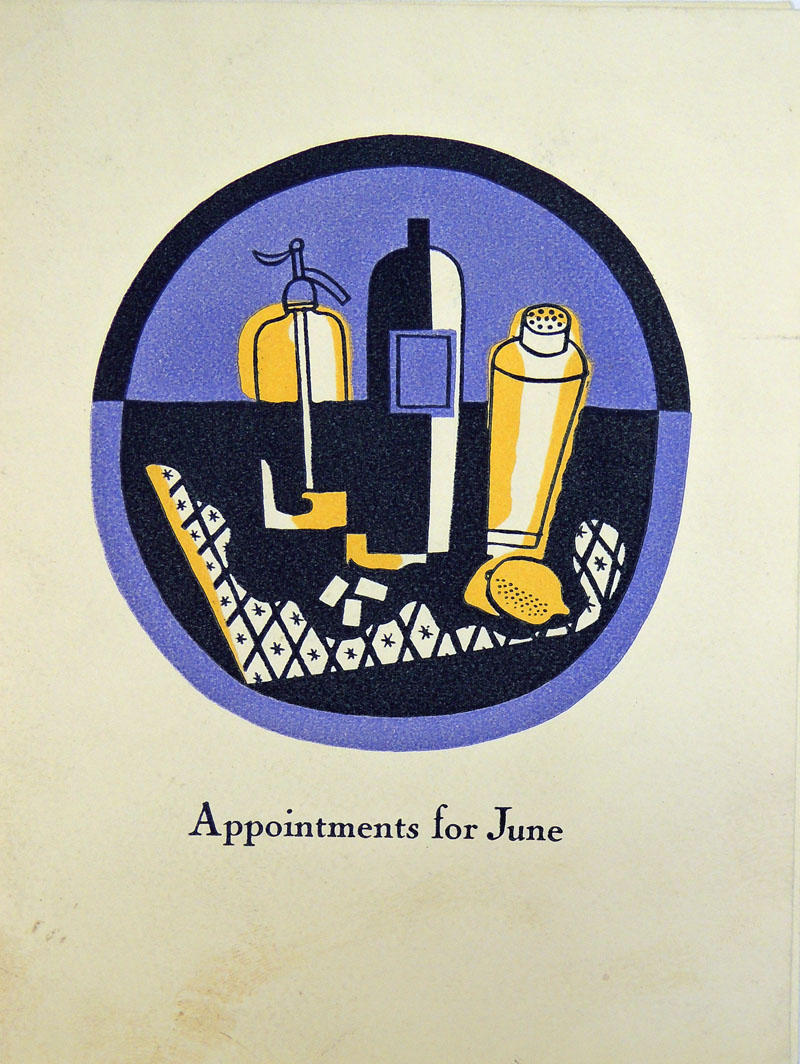
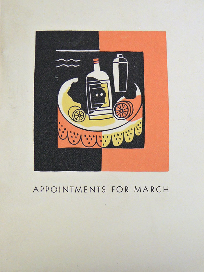
Later after finishing his studies, and getting a new job, Saul Bass met György Kepes, who was a Hungarian-born designer and teacher. Kepes was one of Bass’s most major influences, as not only did he teach Bass about the ways of design, he helped to transform the way that Bass thought about design and even the way that Bass would lay out his designs.
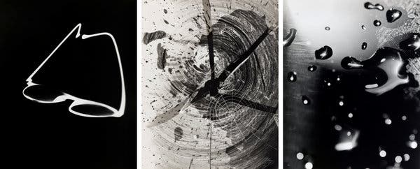
Upon comparison of the impact that both Trafton and Kepes had on him, Bass said,
“Trafton brought me into the room and led me to the door. I tried it. But it wouldn’t open. And Kepes said, ‘To the left.’ I turned it. The door opened. He really just set me on fire…I felt like my pores were palpitating, you know?”- Jennifer Bass, Soul of Bass, Page 18.
In other words, Trafton taught Bass everything he could possibly know, but Kepes opened Bass up to another entire world of design that he had never been able to access or understand before, and Kepes helped him explore it.
Due to the mentoring Kepes gave Bass, Bass then two years later, after developing his skills far further from Kepes help, he was invited to join a major advertising company in Los Angeles. Following this invitation, Bass’s career simply took off in a new and improved direction, however this time he had plenty of new ideas about,
“modernism, psychology and the social responsibility of designers, and he was to become one of the most articulate members of his profession, a man who did pro bono work for organisations such as the Girl Scouts of America, Human Rights Watch and the Special Olympics.”

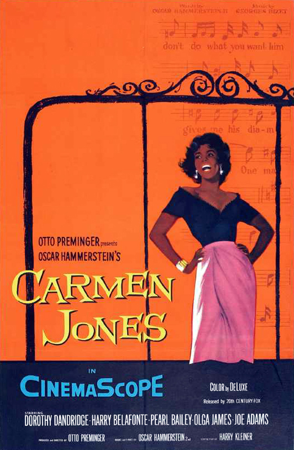
Bass was now a new man with new ideas and a had built up a much wider spectrum of imagination, which would come into use for him later on in his career when he began his new unique designs for graphic movie posters. At first Bass struggled to portray his unique ideas to a platform as most companies wanted to stick to the modernism style of the time, as straying could pay out, or it could’ve been a risk that impacted they’re companies due to people not accepting or possibly not understanding Bass’s postmodernism creations. It wasn’t long after his business opened that he was offered what appeared to be his big break that could push him further into the industry than he had ever reached before, when Otto Preminger invited him to design a poster for his new film, “Carmen Jones.”
The poster introduced to the world the new simplistic style of design that Bass had developed over all of his years, playing with illustration designs, and being mentored by two incredible designers. The poster featured a complete orange background and a woman standing on the front appearing to sing. Bass used a score faded in the background of the design to enhance the idea of her singing. The image was simplistic in its own way, with the poster simply being a woman standing and singing. It wasn’t quite as simplified as some of Bass’s other work, and this was most likely due to the fact that this was Bass’s big break so he hadn’t yet completely broken out of following the typical designs of film posters of the time.
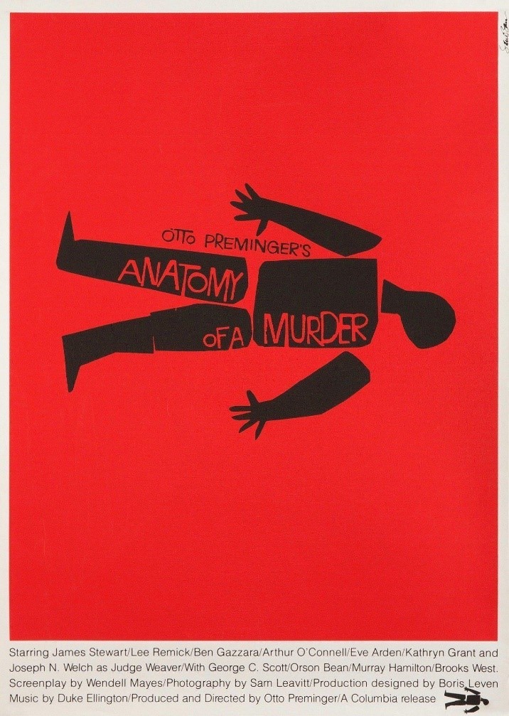
Another one of Saul Bass’s earliest famous creation was a film poster he made for the movie “Anatomy of a Murder”. The reason the film poster was so famous, was due to the simplistic layout and design that Bass used. It was an unseen new design for posters, that he had begun to develop. Anatomy of a Murder’s poster was so famous because Bass had already grown in popularity from his design of “The Man with the Golden Arm”, and “Carmen Jones.”
In the Anatomy of a Murder poster Bass used a red background and a simple blocky silhouette of a person lying on the ground. The uniqueness of this design comes from how Bass uses black shapes to make up the broken-up body of the person on the cover, rather than displaying a detailed visual of someone lying dead on the ground. He then uses the black shapes that make up the figures body to display the title of the film in contrasting red text, making the silhouette appear almost shallow as if there are gaps in the body, which could be a metaphor that Bass is using to hint of death in the film. This idea is also heightened with the face that the body is disjoined in many sections hinting of the possibility that the body is decapitated in many places.
Bass uses all these minimal artistic metaphors to create a simplistic poster that captures the guts of what the film could be about. I feel that this design is definitely one of my favourite Saul Bass designs, with the way he captured and depicted the film so elegantly, but yet with so much simplicity. The red background could indicate blood, again symbolising the genre of the film.
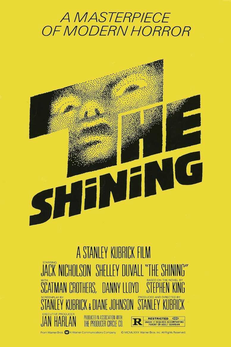
Yet again in this poster it is almost immediately obvious that this is a Saul Bass piece. Immediately we can see that he uses a steady background colour like he has in the majority of his previous poster designs. Instead of using a silhouette or shapes to display an image on the cover, this time Bass uses the text of the title to display a pixelated image of the protagonist of the film. The image is blurred and distorted in order for Bass to portray the genre of the film, which is a horror.
Bass using the striking contrast of the black text and the background colour to faintly display the broken-up face creates a unique image in his typical simplistic design. Saul Bass also uses capitals and thick black font to give the name of the film a much harsher aesthetic, and give room on the word “the” for the blurred face to be revealed.
I think this is a very smart approach to the poster for this film, as I know that the film is a horror about an insane man. Bass has clearly captured the man’s insanity on the cover of the poster, however still managing to keep the image extremely simplistic. It’s said that Kubrick had Bass redesign the poster for the film around three hundred times before they agreed on a final design.
In conclusion, Saul Bass’s work heavily influenced the likes of graphic design today. Some of Saul Bass’s logo designs that he created lasted for years to follow as the company’s logo without any updates or modifications. Bass created logos for some major companies throughout his life, from Kleenex to AT&T. He created a logo for the United Airlines in 1970 which they kept all the way up to 2010, proving to us that Saul Bass did have a major impact on logos, movie posters and the entire design industry as a whole during his life. This was also the case for his film poster designs, that our still used to advertise his film. They also helped with the beginning of the post-modernism movement that began while Bass was alive. He was a great influence of the movement with his designs.

